It's what I am.
Album covers
This is a rather pointless post on album covers.
I had never listened to Electrelane before, despite several albums in the house, but when I saw No Shouts No Calls, I was struck by the great cover and gave them a go and now I like them (just as they go on hiatus...).
All these albums are in our collection and only include music I regularly listen to so
there will be no reference to Blind Faith's Blind Faith (eww) or to Luna's The Days of Our Nights.

Electrelane - No Shouts No Calls - I like the simple colours and the fact it looks like a badge.

Espers - II - This cover in no way misleads as to the content of the album.

Aimee Mann - Lost in Space - Aimee's covers are usually unenticing and this I suppose for many would be no exception but the songs on the album are gloomy and you get what you pay for. Pylons are oddly beautiful, I think.

Audrey - Visible Forms - This is pretty.

Nina Nastasia - On Leaving - I like images of black and white trees a lot.
Mirah - Advisory Committee - To be honest, this cover makes me feel a little uncomfortable and yet it is intriguing.

Laura Veirs - Carbon Glacier - Another black and white image which I find arresting. If I was flicking through the racks in a record shop I would definitely stop at this.

Paula Frazer & Tarnation - Now It's Time - Aww, this is so beautiful.
Covers that don't work for me:
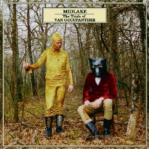
Midlake - The Trials of Van Occupanther - Wtf were they thinking? It must have been fun to dress up like that but how many casual sales did they lose?

Kate Bush - Aerial - Kate Bush's sleeves are generally naff (except The Dreaming) but this is plain horrible. I bought Aerial regardless but I think this is dated and ugly. Kate, take at look at any Espers album cover, that's what your music is like.

Bat for Lashes - Fur & Gold - Flipping heck, thank goodness Natasha Khan's music is in better taste than her costumes and artwork.
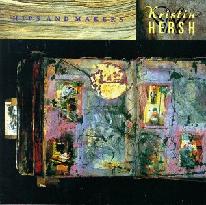
Kristin Hersh - Hips & Makers - This is actually not that bad for a work of art. I can imagine it on my wall but in miniature on a CD case (or LP sleeve) its too messy and dirty looking.
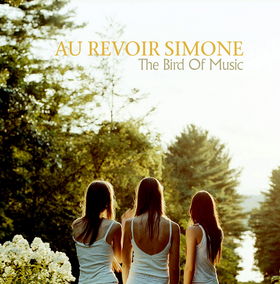
Au Revoir Simone - The Bird of Music - Snore.
Let's Fold Scarves / last build: 2025-02-11 14:19